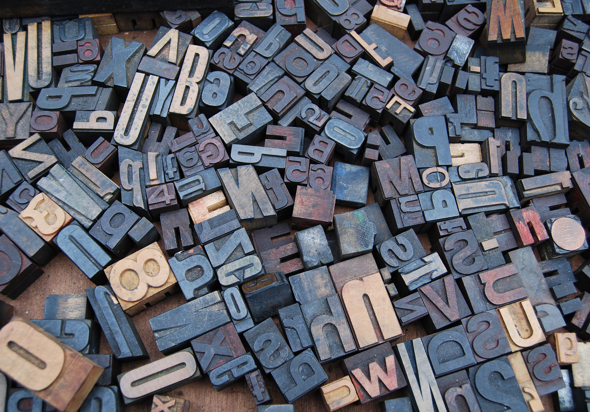
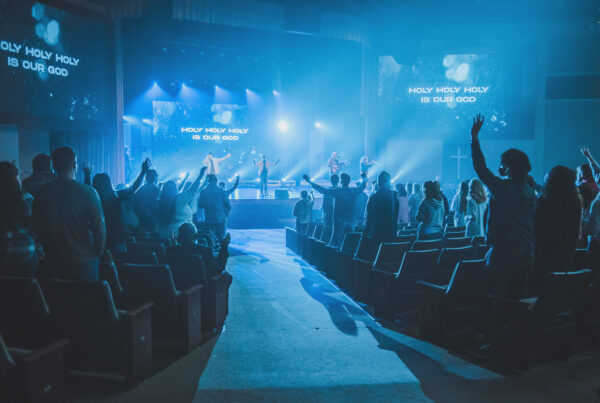
Sunday morning media is so much more than pressing a spacebar and tossing random pieces of content on a screen. The art of visual worship starts with the longing to ensure that every projected lyric and image is excellent and points the congregation towards God. One of the simplest ways to make a Sunday morning presentation look great is to use a proper font. You’ll notice really quickly that I’m a bit of a purist when it comes to this matter. But, the goal of my simplicity is to allow the font to go unnoticed to the worshipper. Here are four of my go-to fonts for worship lyrics that accomplish this best.

What are your go-to fonts for worship lyrics?
Let us know by leaving a comment down below.
Backgrounds Provided By ChurchMotionGraphics.com


I’ve really been liking Gil Sans MT in Bold as of late. We had been using Georgia, but with the slight serifs, it wasn’t as clearly readable, especially for the older people in our congregation. Thanks for this post, I’m thinking I’ll give the condensed Helvetica a try, I really like the look of it.
Been using the Helvetica Neue Condensed Bold recently. Like it a lot. What do you do as far as shadowing on the letters? Do you use any? Like the look of the Myriad Pro Bold as well. Will try that.
Our go-to is Helvetica Bold too! I’m liking the Myriad Pro Bold too though!
We have been using League Gothic at West Ridge for awhile and really like the look of it for screen lyrics.
I’ve been using Candara Bold lately and I’ve really liked that.
I head to Century Gothic first. It’s got a nice, sleek, modern look to it, yet it’s clear and easily readable. I don’t usually make it bold, because then it just looks too cartoony for my taste. I just have to make sure the font size is large enough, because it is a slightly thinner font. It’s worked well for us! I’ve not heard any complaints of lyrics or scriptures being hard to read.
I’ve found Calibri Bold is a nice font, too.
We use Mediashout for our presentation and I don’t see any of those fonts in there. Do you know of a place where you can download or receive those fonts?
For those who use ProPresenter for Windows, any suggestions on fonts to use? It would be very helpful!
Ours is currently on Avenir. Any advice for when a natural line in a song is going to go over two lines, with no natural spot to break it up? We usually just use a condense font for that one song, but I don’t know if thats what we should be doing. A example is Keith and Kristen Getty’s song, By Faith:
By faith the prophets saw a day
When the longed-for Messiah would appear
With the power to break the chains of sin and death
And rise triumphant from the grave
The third line is hard for us to fit in one line.
For a line like that, I usually shrink the spaces between the text.
For instance, if the font size is 66, I would make the spaces 62ish until it fit on one line. The eye can’t really tell the size difference in the spaces.
Maybe this will work for you guys!
Good tip, Haven!
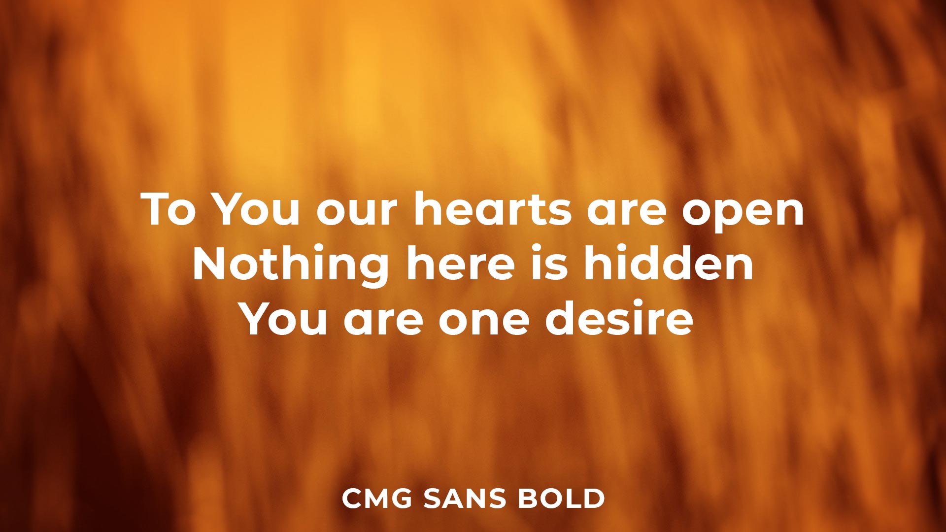
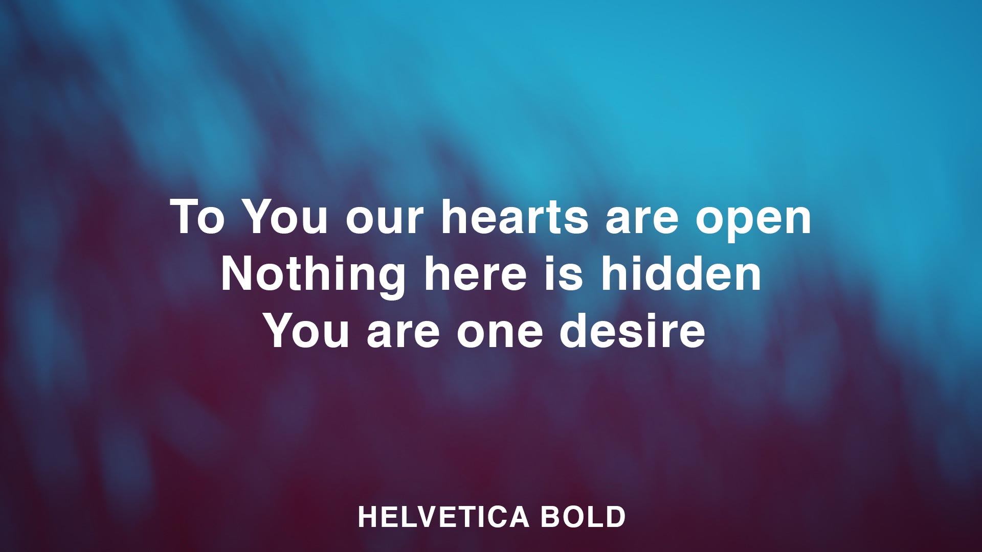
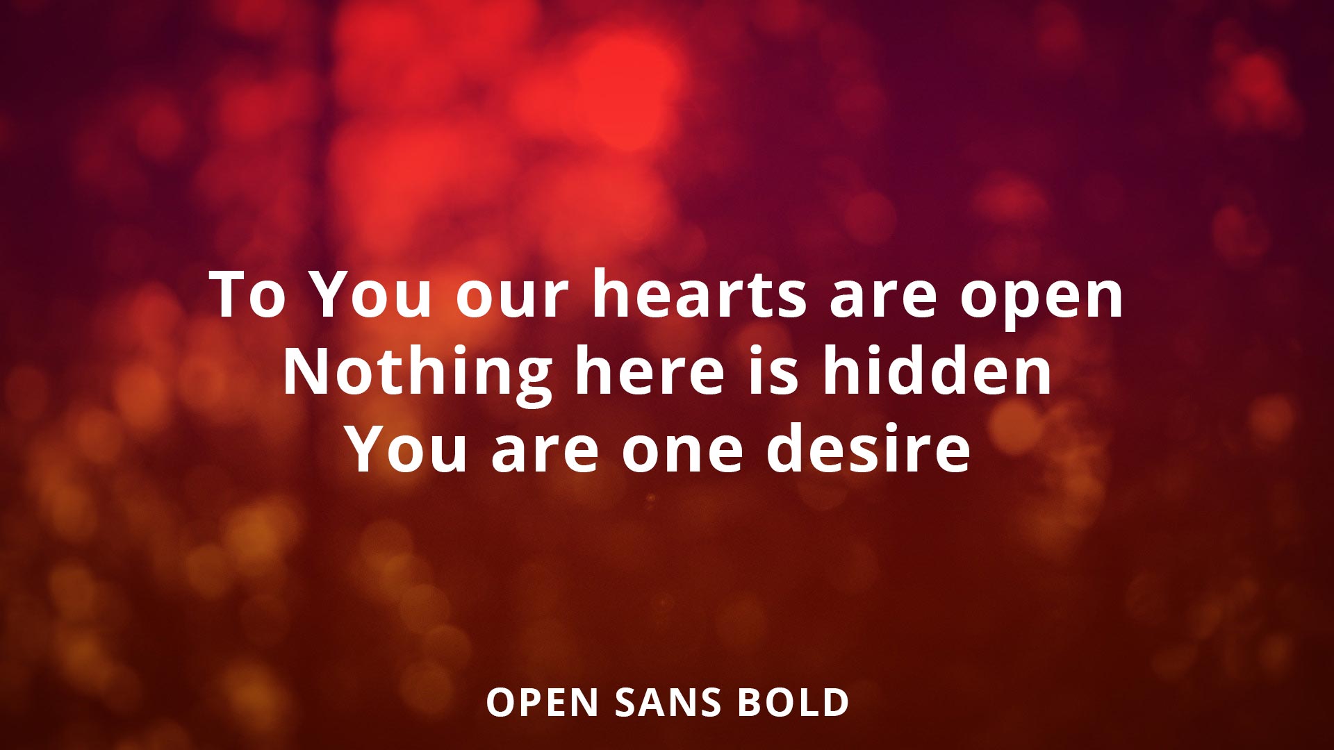
The Sans
We started using a font called BEBAS. Its an all caps font but looks good if you are only using lyrics on the screen.
I use Tahoma, size 26, Bold with Outline – I find it to be very readable for all. Outline or Outline with Shadow can really help the font standout from the background. I have also found that white font instead of black is the best.
We always use Tahoma Negrete Bold, as well. enjoy the look.
I like the Gotham font pack. Bold and clean.
Oh, yeah. It’s awesome!
I used to use Helvetica Neue Ultralight in italic. I ended up having to always make the text bigger so it was easy to see. Honestly, I thought it was a good looking font and had a good modern look to it but I decided to change to Century Gothic Bold with no shadow. I love it now. Thinking about trying one of the heavy Avenir fonts too
Optima Bold has been our go-to font. It’s easy to read but still slightly serifed to make it look sophisticated.
If you are a font geek, you gotta watch the film, Helvetica. It’s a hoot!
Where do you get your worship backgrounds?
Where I can find backgrounds like yours?
These backgrounds are from CenterlineNewMedia.com
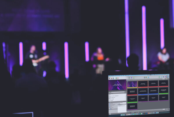
Hi All, although I have operated the overhead system in a previous church I am only just getting into the one at our new church. I like ProPresenter 5 it just seems to be everything I need with more if I want to use it.
Regarding how/what is displayed as Kendall said at the beginning it’s more than just throwing words up on a screen. This is particularly true for those with visual problems, typically we think of how clearly people can see but there’s more to it than that. I suffer with migraines as do a lot of people, others epilepsy and these are factors that must be taken into account. To get back on point about fonts colour contrast is very important not just for clarity but for migraine sufferers.
A high contrast between background and text especially if the background is a light colour can induce migraines in minutes. The best colours to use are a mid blue bacground with white text. Although many of us use an image for background often Bible verese are left on default black on white which is quite literally painful for some migraine sufferers. Changing the default to blue and white makes a huge difference as well as being more restful on the eyes for people in general.
Verdana Bold right here!
Thanks for sharing. We played around with fonts for a while. Baring any special request from our Pastor for a sermon series or what not, we ended up choosing Gill Sans, just because of its clarity from the back of the sanctuary. We have a large senior population in our congregation, so clarity for them was a huge consideration.
Charcoal CY with outlines to 3
Anyone have trouble with ProPresenter displaying large “horns” especially on Ms and Ws when adding an outline of more than about 4? It happens on several fonts including Helvetica, Arial, Tahoma and others.
I’ve found that I really like Century Gothic lately, and I’ve been using Tahoma Negreta since I began as a church tech 5 1/2 years ago.