
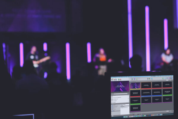
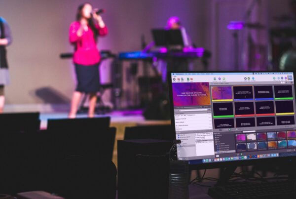
Projecting lyrics may not always be the most exhilarating part of Church Media, but there’s no doubt that it provides a valuable service for those in the congregation. It’s particularly important for newcomers who are less likely to know the songs in your worship team’s repertoire. Because of this, it’s critical that we do our best to design our slides to be both functional and attractive. (Even if people don’t truly read the lyrics you’re displaying, they’re still likely to be distracted if your slides look all jacked up!)
As I’ve visited different churches and studied their media practices, I’ve noticed that it often isn’t huge mistakes that keep lyric slides from looking their best. Instead, it’s the little things that subtly stand out. (Sounds kind of like a small foxes spoil the vine sermon to me!) So, for the next several weeks, we’ll be discussing some quick tips that are super easy to implement, but will make a big difference in your Sunday morning media.
Stick To 2-4 Lines Per Slide
The quickest way to add confusion and distraction to your lyric slides is by having too many lines on the screen. It may be the easiest route for you because it requires less flipping through slides, but this lazy way out is not the way to go. Fill each slide with 2-4 lines max so that it’s easy for new singers to jump in at any time without having to do a word search on your screen. (This also makes it easier for people to close their eyes in prayer/worship and pick right back up when they open their eyes again.)
Bully-free Slides
Some people describe this problem as “orphans and widows,” but I’ve always instructed my media volunteers to avoid having bullies on your slides. Simply put, don’t create small lines of text surrounded by large “bully” lines. While still keeping with the general flow of how the song is sung, arrange your slides to have fairly equal line lengths.
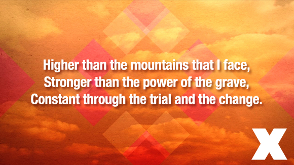
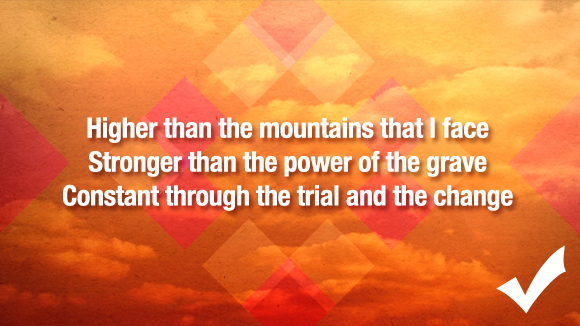
No Commas or Periods At The End of Lines
This is day one stuff, folks! These are lyrics—not sentences that require absolute, perfect punctuation. For a much cleaner look, ditch the commas and periods on the end of lines. The line-break is more than enough for your congregation to recognize that there is a separation.
Are you guilty of these mistakes? What are some more tips for better lyric slides? Be sure to check back with us next week for more tips!


I love this!! Thanks for sharing!
Great post :) Thanks for the tips!!
When putting lyrics on slides I like to ensure that the lines flow with the song and where people will take a breath, where possible!
e.g. you could change the first slide set to read:
In death and in life I’m confident
And covered by the power
Of Your great love
A couple of questions:
When you have to use a certain point size to ensure that people at the back can read the words, this affects how much text you can fit on a line. Do we lose lines to accomodate this? Or is it OK to go across the whole screen?
If your screens are low down is it OK to keep the words at the top, again for the people at the back to see them over everyone in front?
Hey there, David! I definitely agree about going with the flow of how your congregation sings the lyrics. It’s interesting because I tried to read your example as if I was singing the song the way that we normally do and it seemed very unnatural for me. I guess that just goes to show that you can sing songs differently in varying churches!
In regards to the question about text sizing—I’ve spent a fair amount of time on both accommodating the eyesight of elderly and designing slides how I’d prefer them. The “right” answer is to make your text comfortable for everyone, but I feel that how your slides look is just as important. Everyone can see ugly! I would try putting less text on each slide. That way, you can still look good while providing lyrics for the back row.
And, yes, it’s definitely okay to adjust your text position based on your screen position. Just remember to keep your margins consistent across all of your songs. This will make it seem that you actually meant to do this. It’s also good to do this with backgrounds with images at the bottom like this – http://centerlinenewmedia.com/products/view/2130
I hope that helps!
Great Help – Thanks. Can’t wait for the rest of the hints!
This is a great post. I’m gonna show this to some of my other team members. One other suggestion (and it’s only a suggestion) is to de-capitalize the first word of all the lines. There’s really no logical reason as to why the first word of each line is capitalized (other than that Microsoft Word made that an automatic default many years ago). Whether prose or poetry, it makes no sense for a word like “The” to be capitalized right in the middle of a phrase. Because all music is poetry, my team typically eliminates all capitalization except for proper nouns. It works wonderfully!
Thanks for this post Kendall, always great to see examples from other churches. One thing I’d love your view on is how you decide which part of the slide is capitalized? It seems in these examples it is every new line, but do you follow that train of thought if the line begins with a conjunction such as “and”, “but”, “so”, etc. (or words like “if”, “the”, “as”) ?
Our two church plants do it differently, one includes all the punctuation and so capitalizes words that are at the beginning of new sentences, and another doesn’t capitalize anything on the slide besides proper nouns like Lord, I, You (when referring to Jesus).
I’m always interested in hearing suggestions, thanks again for your post and hard work on this blog!
Hi, David. Most of the time I will leave the conjunctions lowercase – even if they are at the beginning of the line. However, if it feels weird, then I’ll just follow the original model.
I’m pretty against using punctuation on slides. I’ll occasionally use exclamation points and question marks, or maybe a comma to separate, but that’s about it.
Thanks for the comment!
Thank you! That is great advice. It is the small formatting details that make a great slide.
What if you’re in a church that is used to hymnals and you’ve recently moved to a blended style? Would you remove the periods and comma’s that everyone is used to? These help make things more clear, particularly for the older members of the congregation. Yes, it adds probably 4-5 minutes, but I’d rather take that 4-5 minutes to make sure many in my congregation can worship un-interrupted.
I’ve also heard it said that some teachers can’t stand having no punctuation… why do something that makes some people feel bothered? To me, punctuation makes it look cleaner.
There’s other things like this past week we sand the song, “There is Power in the Blood.” In that song it says in the chorus, “There is pow’r, pow’r, wonder working pow’r, in the blood, of the Lamb! There is pow’r, pow’r, wonder working pow’r, in the precious blood of the Lamb!” For someone who doesn’t know the song, putting comma’s helps them understand this is where we break. We don’t sing it all together in one continuous line, rather, there are breaks throughout the song.
Hi Kenny
I just joined a new church and they only have three or four people so it’s important for the congregation to sing however it’s hard to follow the song because the words on the screen do not show when there are pauses or some words are accentuated and we didn’t know that… It’s very confusing and people won’t sing because we can’t follow the flow??
Awesome suggestions! Thank you for sharing!
We use all capitals (you don’t have to decide if it should or should not be capitalized) and no punctuation. We try and have no more than 2-5 lines per slide, and we try to have a new line where we naturally pause in the song. For better visibility we decided to use just a plain black background and white letters. The Calbri font seems to work the best for us.
All great stuff, Debi!
Where do you guys land on justification? Our church currently justifies lyrics to the left, but I’m considering switching to the center. Thoughts?
Hi, Michelle –
I vote centered 99.9% of the time. The only time I go left is when I have a strong visual on the right.
I hope that helps!
Kendall
Recently, I took over setting up, organizing ProPresenter and creating the song presentations from the person who used to do it. Looking back at the song library from the past few years, I’m noticing that many of the songs don’t have any punctuation at all, such as commas in the middle of a line to set off phrases and direct address. Looking around, most lyrics I see don’t use commas at all – not just at the end of lines. Is there a reason to not use any commas, etc., even if in the middle of a line?
Hey, Jonathan. Good question. I only use punctuation on my slides when it’s absolutely necessary for the reader. It’s just cleaner that way. Hope that helps!
Thanks for this, currently 5 am and I’m looking through my line up and for some reason I felt like it didn’t look right, so it’s nice to see how others set theirs up. I also only use commas when I really think I have to. Like right now I have Breakthrough and on one line I have “there will be breakthrough, there will be breakthrough” in this case it looked off without the comma. Clearly I wrestled with the decision ;)
Thanks for the comment! I’m happy to hear that this article helped. :)
Great post, but I’m grappling with the issue of vertical alignment, specifically ‘align top’ versus ‘align middle’. The dilemma is that if you follow the natural phrasing of a stanza, a chorus, or a bridge, you may have any combination of 1, 2 or 3 line blocks following one another. (We maximise on 3 lines for a segment.) I contend that it is most pleasing to the eye (and brain) if the text always starts vertically in the same position, and this can only be achieved with ‘align top’. ‘Align middle’ gives the appearance of the text shifting up and during the progression of the song. I have seen media presenters rework the way lines are grouped to fix the number of lines in a segment to (for example, to 2). I think subconsciously they are fixing the number of lines to achieve vertical consistency, but don’t realise the underlying motive. The eyes and the brain seem much calmer when the text of a subsequent segment is vertically the same as the previous segment. What do you think. I don’t think you’ve tackled this issue in your piece! JRS